Email Marketing
E-mail Guru
I’ve been immersed in the past 19+ years of evolution in e-mail marketing practices and coding advances. Always striving to push the cutting edge of design practices, I ensured Cooking.com was the first in the food and cooking industry to implement responsive coding in our e-mail program. Through extensive testing and quality control, we ran a virtually error-free program, sending an average of 1400 emails/year across the entire Powered-by platform of brands. Cooking.com was selected as a finalist for the 2013 eTail Best-In-Class Award for Email Marketing.
E-mail Workflow
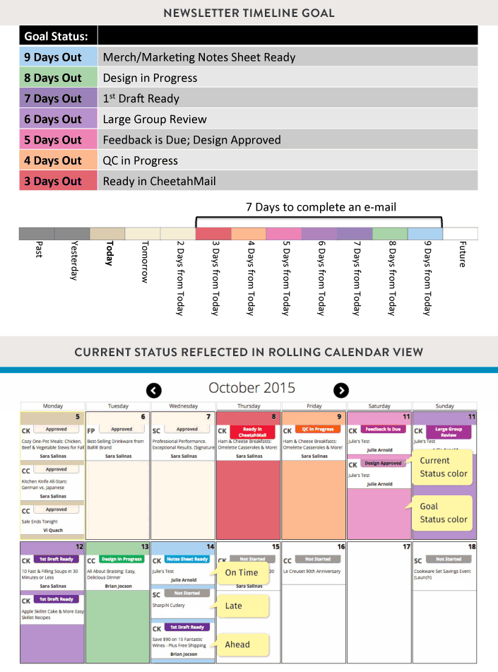
At Cooking.com, I restructured the overall e-mail workflow across departments in order to reduce the production timeline, while establishing communication points for client feedback. With support from the tech team, I devised a custom-built "newsletter tool" that acted as a centralized location for all e-mail data to reside, which the tool then utilized to display that information in different views for each phase of the newsletter process: a calendar view for planning and tracking; a list view that can be filtered by date, company, type, designer, etc; and a QC view that displayed the emails and had a commenting and flagging feature to communicate changes.
The calendar view featured a rolling calendar of expected deliverable dates with a publicly shared web interface that displayed each mailing's actual current status vs. the desired status in an easy to read view, making it easy to load-balance between designers to keep the pipeline going during busy times. Aside from the calendar view, newsletter data also fed to a custom QC reporting interface that allowed all communications to live in a central location, ensuring that no feedback would get lost in anyone's inbox.
Modular Email Template
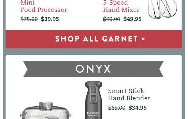
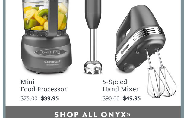
The design and coding process was templatized in an object-oriented system of self-contained components that could be stacked or rearranged into numerous configurations, like LEGO blocks. The goal was to be able to easily change or adapt individual design patterns without altering the system as a whole. Adopting modular design and reusable patterns into our design workflow improved the quality and consistency of what we sent, while speeding up the daily output.
Designing Responsively
Touchable Spacing:
The mobile header is rearranged for narrower width. Reduced number of links in top nav making it easier to touch.
Show/Hide:
We can show one image for the desktop version and a different image for the mobile view to accommodate smaller screens. At mobile sizes, the desktop version hides, and the version customized for mobile is shown instead.
Resized, but Mobile Minded:
Hero image is the exact same image as shown on desktop, just scaled down with CSS. For these images, we are mindful of smaller screens in design choices and lean towards zoomed in images and larger text sizes that reduce well.
Reflow:
The side-by-side product name and body text reflow to a stacked layout on mobile. They use the same image files, but they are rearranged using CSS.
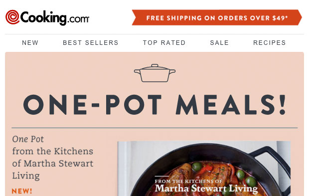
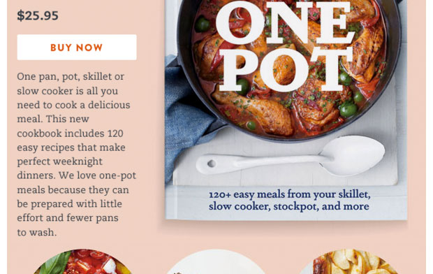
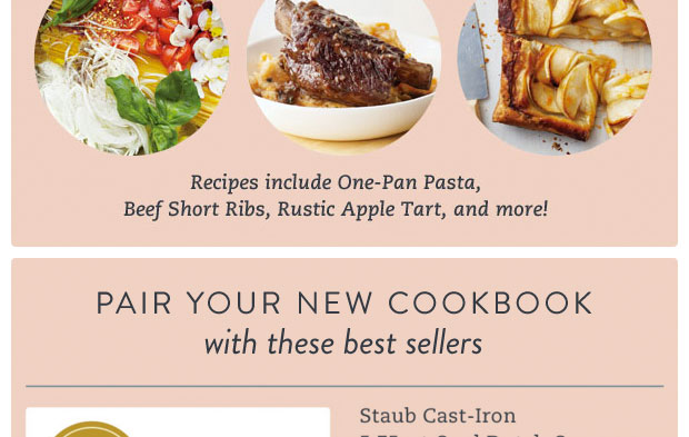
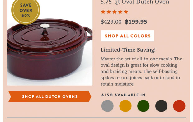
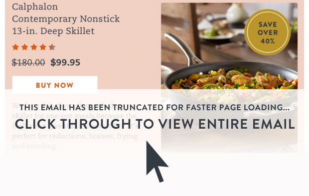
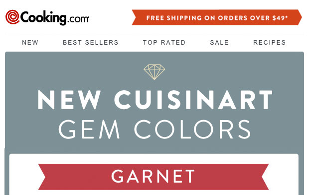
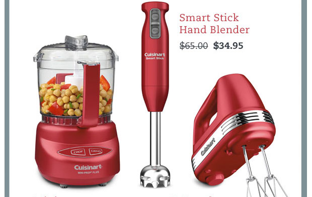
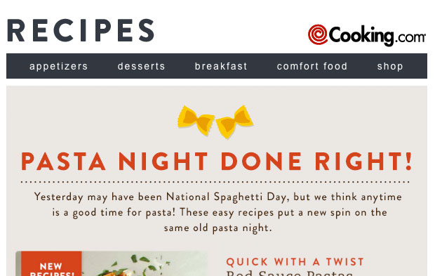
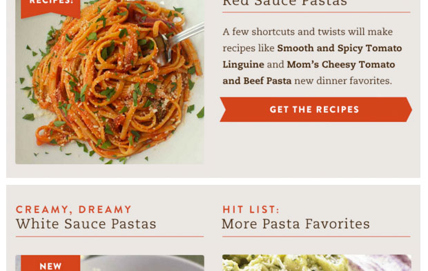
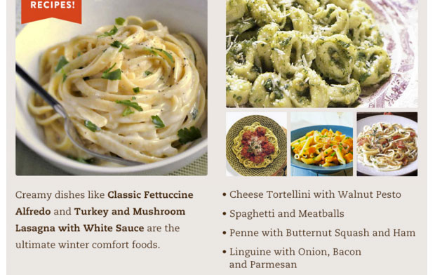
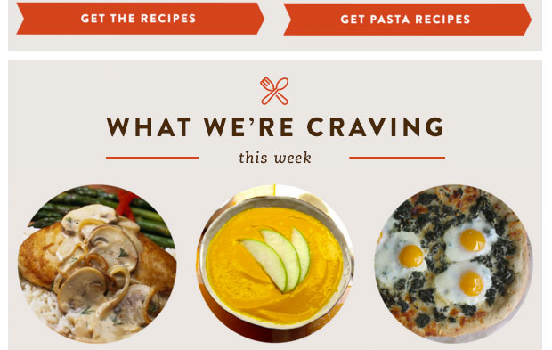
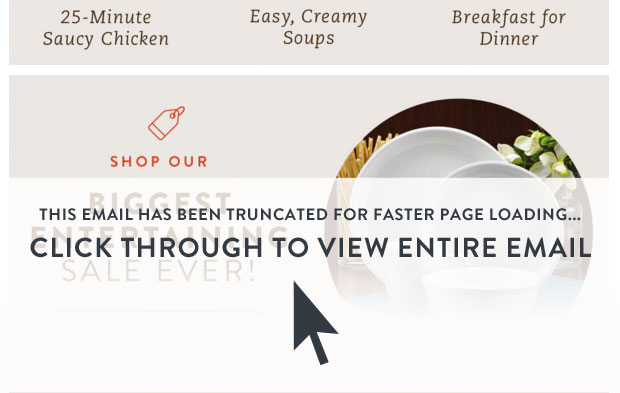
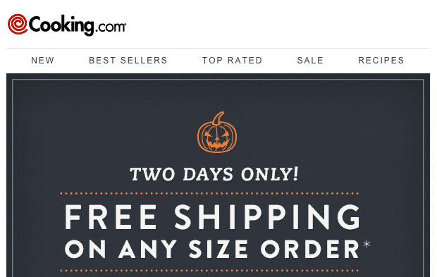
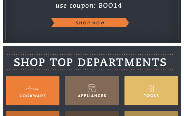
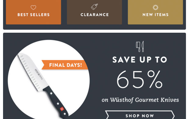
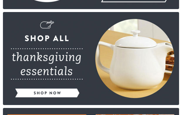
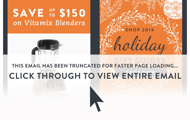
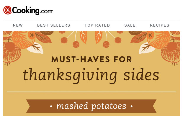
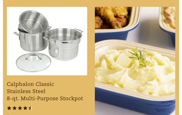
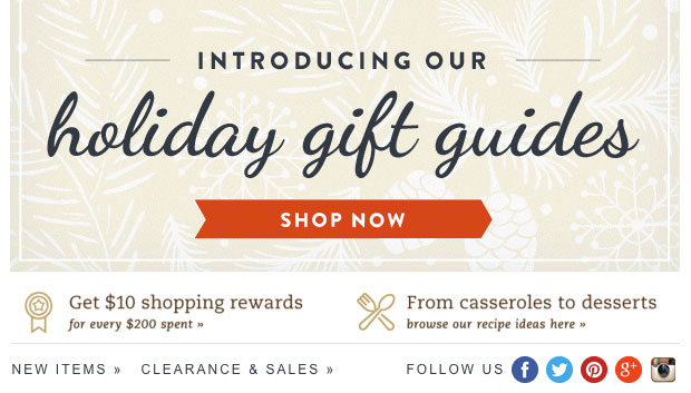
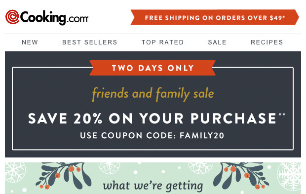
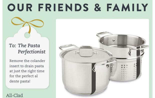
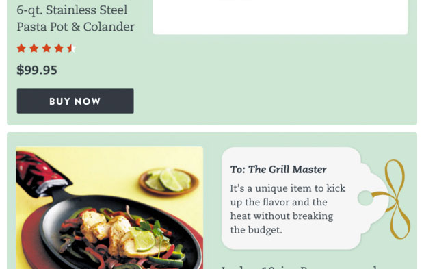
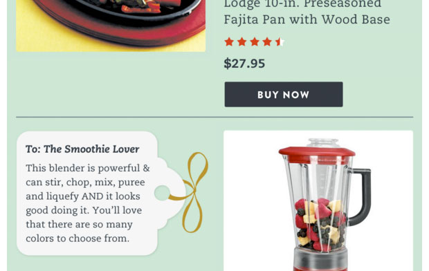
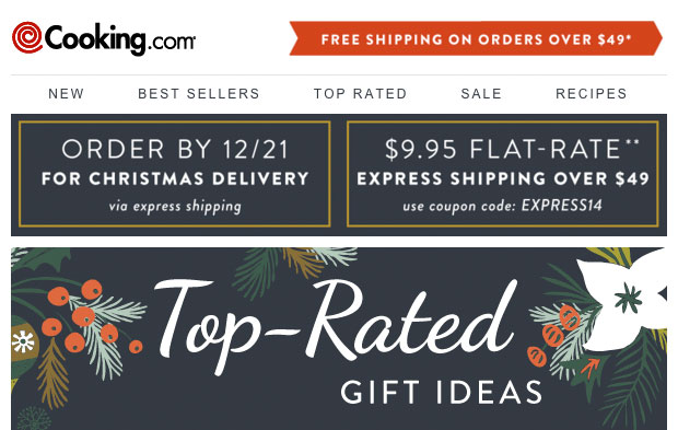
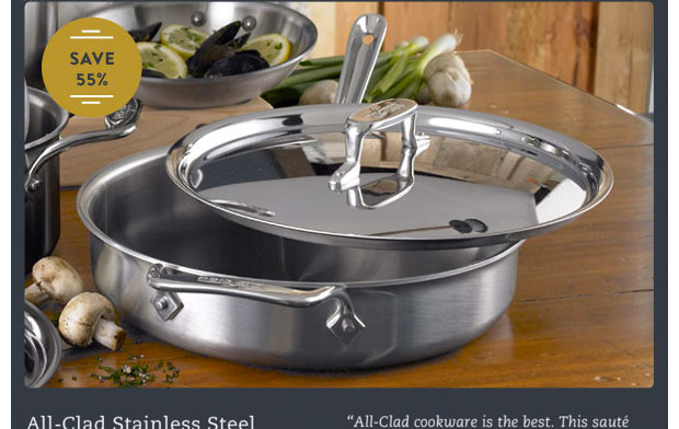
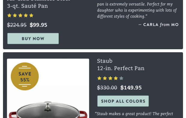
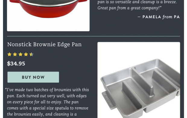
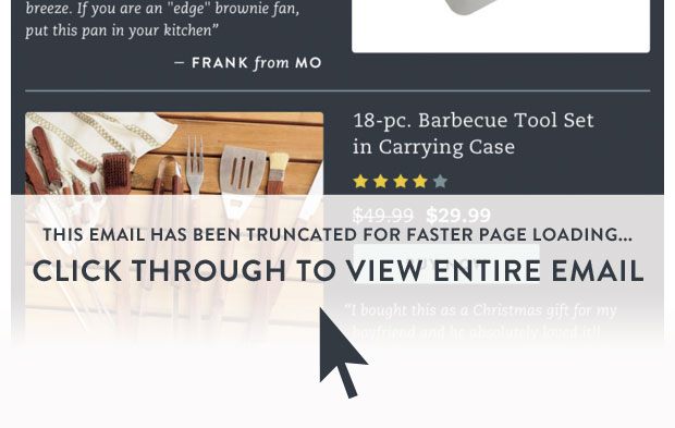
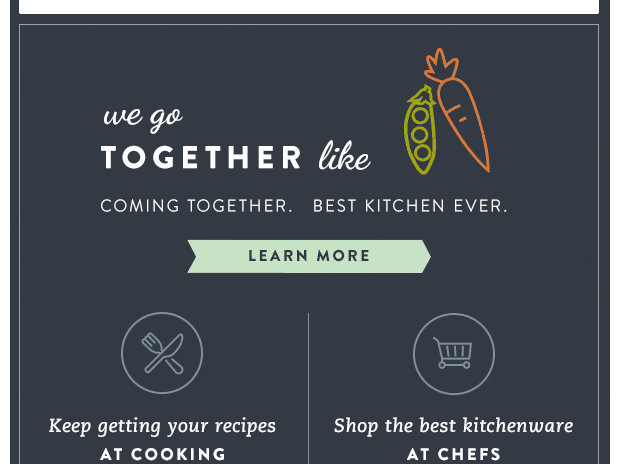
Below, I've included some examples of Cooking.com branded e-mails - click to open the code view and resize to see how the layout reflows at smaller screensizes...
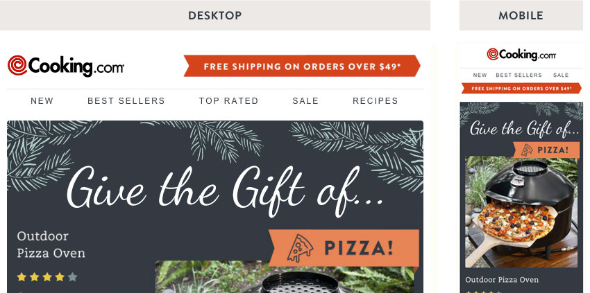
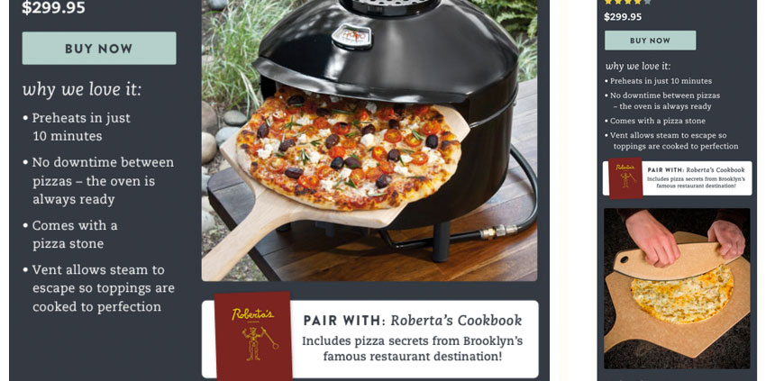
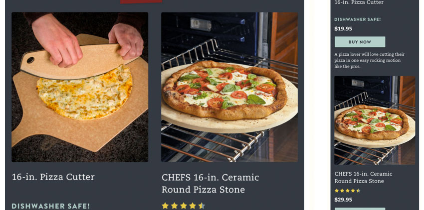
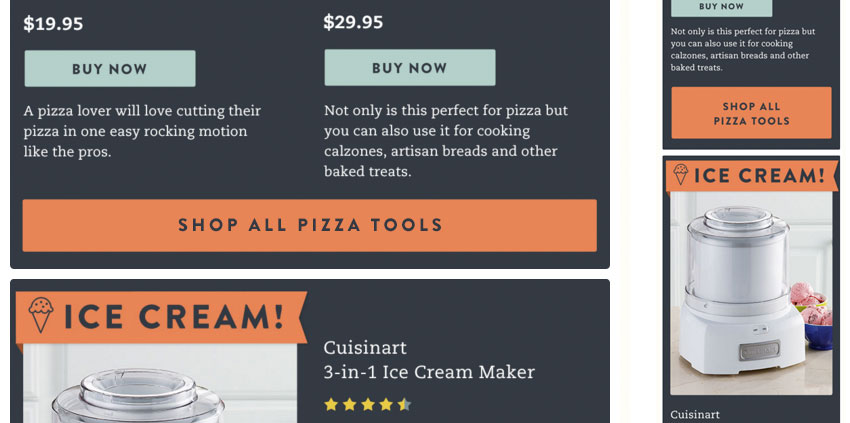

Cooking.com Email Examples


Modular Email Template Design System, Loot Crate
Resize your browser to see how the components adapt for desktop to mobile views.